7.2 KiB
+++ title = "Multi-column layouts for static sites using macros" date = 2019-07-10 [taxonomies] skills = ["html5", "flexbox", "@media", "markdown", "macros"] +++
Today, we're gonna see how to build a simple multi-column widget with the Zola static site generator (SSG). That's a common pattern in webdesign to have several columns of same width to present content. While many people load up a full CSS framework (such as Bootstrap) to achieve this, we'll simply use common and well-supported CSS Flexbox properties.
Our widget should take a parameter for a page (inside the content/ folder), parse the page's content and split it in different parts, then output those parts in separate columns (visually). For this demo, we will output 3 columns of same width and spaced evenly, but each column will fall back to full-width when the screen is too small (using media queries).
Please be aware that i'm not a graphics designer so everything you'll find below is more or less ugly but functional. I'd be glad to receive feedback on making it all prettier!
Organizing the content
So first, we want to find a convenient way to organize the content of our columns, so it can be easily edited and translated. As with most SSGs, we can use Markdown pages with Zola to describe our content. To separate the different columns within the Markdown document, we can use thematic breaks that compile to <hr /> HTML markup. These thematic breaks are used to separate (in meaning, and sometimes visually) different parts of the content: chapters of a book, slides of a presentation, or in our case columns for our webdesign.
These thematic breaks are triggered by having three or more consecutive dashes (-), stars (*), or underscores (_). For example, as of writing this article, the footer for this blog is generated from the following Markdown page content/_common/footer.md:
+++
title = "Footer"
date = 2018-01-03
+++

# KOPIMI
© [CC BY-SA](https://creativecommons.org/licenses/by-sa/4.0/) license. Some graphics not mine. Just reproducing them here because [sharing is caring](https://kopimi.com/) and **FUCK PRIVATE PROPERTY!** [Problem?](/contact)
-----

# Topics
⚠️ Personal website & opinions. Tech-savvy anarchism / libertarian communism. Not interested? Feel free to browse away!
-----
<i class="fa-4x">~</i>
# Tildeverse
This blog is kindly hosted by [thunix.net](https://thunix.net), a proud member of the [Tildeverse](https://tildeverse.org) federation of autonomous hosting coops and cyber-hackerspaces.
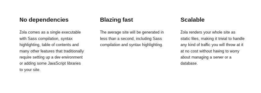
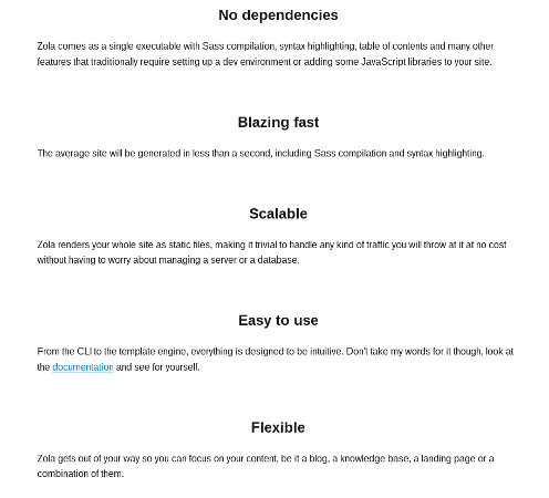
Multi-column layout with flexbox
So we want to reduce the boilerplate for our layout to a minimum, like so:
<div class="pillar">
	<div class="pillar-column">First column</div>
	<div class="pillar-column">Second column</div>
	<div class="pillar-column">Third column</div>
</div>
To go alongside this HTML, we need some basic CSS styling:
.pillar {
	display: flex; // We start a flex container (horizontal direction by default)
	flex-wrap: wrap; // Columns should not grow outside their box
	align-items: flex-start; // Columns should start at the top of their row
	justify-content: space-evenly; // Columns should be spread horizontally
}

@media (min-width: 48em) { // Following rules only apply on screens larger than 48em
	.pillar-column {
		max-width: 33%;	// On wide screens, a column should not exceed 33% of container width
	}
}
Building columns from the content with a macro
Zola has an amazing macro system, which basically allows us to define custom functions directly from within our templates. These macros accept parameters and can generate different output depending on them. Tera, the template engine powering Zola, has docs about the macros.
So we want to build a macro that:
- fetches content from a Markdown page
- splits it in different parts following thematic breaks
- outputs markup to place the parts in separate columns
Here's what this can look like in a templates/macros/widgets.html file:
{% macro pillar(contentPage) %}
<div class="pillar">
    {% set page = get_page(path=contentPage) %}
    {% set columns = page.content | safe | split(pat="<hr />") %}
    {% for column in columns %}
        <div class="pillar-column">
            {{ column | safe | trim }}
        </div>
    {% endfor %}
</div>
{% endmacro pillar %}
Now that our macro is assembled, we can call it from any template. On this website, i've included such a layout in the footer in templates/index.html:
{% import "macros/widgets.html" as widgets %}
(…)
<footer>
    {% block footer %}
        <hr>
        {{ widgets::pillar(contentPage="_common/footer.md") }}
    {% endblock %}
</footer>
Of course, we can also create a shortcode that wraps around it, if we want to summon a multi-column layout directly from within our content pages.
Translations
The get_page function used in the macro does not seem to return the localized version of the page at the moment. And this usage is not mentioned in the multilingual docs. This will probably be addressed upstream at some point. There's a discussion around a proposal for translation submitted by Keats, maintainer of the Zola project.
Styling the layout
For the blog, i used an additional rule for styling. I want the first element in the column, when it's an image, to be of bigger size. This is the rule used:
.pillar-column > p:first-child > img:only-child { // Any single image, child of the first paragraph of a pillar-column
	height: 4rem; // Is 4 times bigger
}
Of course there's a lot more you can do to make the style more responsive, more modern and more pleasant. I would love to see people coming up with their own stylesheets, because i'm not a designer :)
Conclusion
Separation of concerns is important when building a website. We want to make it possible for website contributors to edit the content of the website without speaking HTML/CSS because we want to leave that to webdesigners. By leveraging macros and thematic breaks within content pages, we can allow many parts of the website to be editable directly from Markdown files, lowering the barrier to contribution and ensuring modifying the content of our website will not break the layout in terrible ways.
This pattern for building static websites AFAIK is not widely spread, and doesn't have a name yet. But there's room for improvement and innovation in this space that will push us towards websites that are easier to build and to maintain in the long run. This also enables us to share short macros and styles around so we don't have to reinvent the wheel every single time. Let's make it happen!